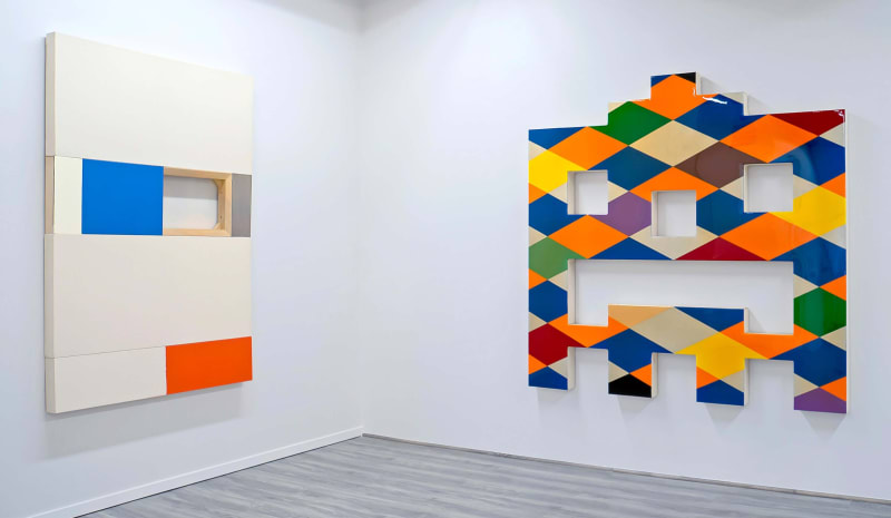
Lines, circles and blocks are the basic ingredients of hard-edge color-field painting, a style that developed in the 1960s. A few decades later, the artists of Pazo Fine Art’s “The Neo & The Geo” returned to these elements, but with machine-like precision and a stronger emphasis on 3-D forms. In their 1986-1995 output, painting verges on architecture.
Of these four New Yorkers, once known as practitioners of “neo-geo,” only Michael Scott is represented by pieces in a standard rectangular painting format. His monochromatic pictures, executed in enamel pigment, position black lines in orderly patterns. The jazziest of his three entries consists of regular arrays of horizontal segments, but he varies the width of the lines and the spaces between them to create a sense of pulsating motion.
Li Trincere, the only woman in the group, is showing immaculate pictures whose two-toned arrangements of elemental hues — one is red and black, the other red and white — are complicated by the use of shaped canvases. The most vibrant pieces are by Mark Dagley, whose brightly colored, methodically deployed triangles and diamonds are disrupted by cutout sections or by being placed parallel to the floor.
The cutouts are even more striking in the work of Max Estenger, who builds wood-framed windows into painting-like constructions that also include sections of stainless steel and raw canvas. The use of canvas is an homage to Washington colorist Morris Louis, according to an essay by show curator Paul Corio, who notes that Dagley grew up in the Washington area and also is an admirer of Louis and his peers.
The earliest Washington colorists did not make hard-edge pictures, and that looseness may have inspired an intriguing touch in Estenger’s “Osha (White, Blue and Orange).” The picture is as exactingly rendered as all of those in this show, except that one border of its orange rectangle is a bit ragged. This intentional flaw is a subtle acknowledgment that “Osha” is, at heart, a painting.


